Subtotal $0.00
The Psychology of Logo Colors: Why They Matter
When it comes to branding, the colors in a logo have a significant influence on how a business is perceived. Color psychology plays a vital role in logo design, as different shades evoke various emotions, associations, and reactions from viewers. Understanding these psychological effects is key to crafting a memorable logo that resonates with your target audience.
Why Logo Colors Are Important
A logo is often the first visual interaction between a brand and its audience, representing the company’s values, personality, and identity. The choice of colors can instantly communicate a message and shape first impressions. Studies show that up to 90% of a product or brand’s initial assessment is influenced by color, making color selection a crucial aspect of the design process.
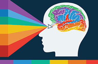
How Color Affects Perception
Colors deeply impact human emotions, behaviors, and interpretations. Each color has unique psychological and cultural associations, which can be used in logo design to project a specific brand image and prompt desired responses from the audience.
- Red: Bold and attention-grabbing, red conveys passion, energy, and urgency. It’s often used by brands seeking to project power, intensity, or excitement.
- Blue: Known for its calming and trustworthy qualities, blue suggests stability, intelligence, and reliability. It’s a popular choice for industries like finance, healthcare, and tech, where credibility is key.
- Green: Green is linked with nature, growth, and harmony, often conveying freshness, sustainability, and environmental awareness. Brands focused on eco-friendliness or health frequently use green.
- Yellow: Vibrant and cheerful, yellow evokes optimism, creativity, and warmth. Brands aiming to project positivity and approachability often choose this color.
- Purple: Often associated with luxury, creativity, and spirituality, purple suggests mystery, exclusivity, and sophistication. It’s commonly used by brands that want to appear innovative or artistic.
- Black & White: While not colors in the traditional sense, black and white convey simplicity, elegance, and timelessness. Black suggests authority and sophistication, while white represents purity and minimalism.
The Power of Color Combinations
In addition to individual color meanings, combining colors in a logo can enhance brand perception. Complementary colors, like blue and orange or red and green, create balance and harmony, while contrasting colors, like black and white or blue and yellow, add visual interest and dynamism.
Key Considerations for Choosing Logo Colors
When selecting colors for a logo, several factors should be taken into account:
- Brand Personality: The colors should reflect the brand’s values and personality, conveying the right image to the audience.
- Target Audience: Choose colors that resonate with the preferences, demographics, and cultural associations of your audience.
- Industry Standards: While standing out is important, it’s essential to consider industry norms to ensure your logo is seen as professional.
- Accessibility: Colors should be easy to read and accessible to people with visual impairments, such as color blindness.
- Versatility: The colors should work across different mediums and sizes, from digital platforms to print materials.
Successful Logos Using Effective Colors
Many successful brands have leveraged the power of color to create lasting impressions:
- Coca-Cola: The iconic red and white colors evoke feelings of nostalgia and refreshment.
- Apple: The minimalist black and white color scheme conveys sophistication and technological innovation.
- Tiffany & Co.: The signature Tiffany blue represents luxury and exclusivity.
- Whole Foods: The green and white colors reflect the brand’s commitment to organic and sustainable products.
- FedEx: The bold purple and orange colors create an image of efficiency and reliability.
Conclusion
The colors in a logo significantly shape how a brand is perceived and its connection with its audience. By understanding the psychological impact of color and carefully selecting hues that align with brand personality, target audience, and industry standards, logo designers can create a powerful visual identity. A well-chosen color palette helps a brand stand out, conveys its values, and leaves a lasting impression in a competitive marketplace.

Comments are closed